Advertisement
Fine-tune your portfolio
Explore strategies designed to help maintain growth potential for whatever comes next.
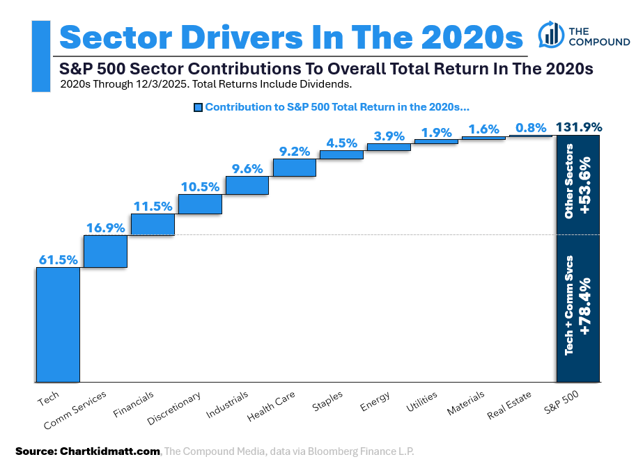
The S&P 500 is up 131.9% in the 2020s so far.
Not bad.
But where are those returns actually coming from?
In today’s chart, I zoomed out on the decade and measured the contribution by sector to the S&P 500’s overall total return (dividends included, please don’t come at me).
Here’s what you’re looking at:
Light blue bars = each sector’s contribution to the S&P 500’s return in the 2020s.
Dark blue bar = S&P 500’s overall return in the 2020s.

Real Estate, lol.
I knew Tech has carried this decade, but I was still shocked when I ran the numbers.
61.5% of the S&P 500’s 131.9% return has come from Tech.
No other sector even comes close.
Loop in Comm Services and that’s 78.4% of the 131.9% overall gain in the S&P 500 coming from just two sectors.
Incredible.
Thank You
I just wanted to pause and say thank you, sincerely, for following along and taking an interest in my work.
The support of this blog and my charts has far exceeded any of the expectations I had set when I first started writing.
My first post (on 8/1 of this year) went out to 14 people. Actually, I think three of the emails were my own so maybe it was 11.
Either way, I got nervous butterflies when I hit send to those 11 people because I hadn’t written long-form since I was in college (and all I’ve done since graduating 3.5 years ago is make charts).
So why would someone want to read my writing?
I thought…
You guys of course proved me wrong. 2,770 of you.
Now, you could only imagine the butterflies I get hitting send on a post. It’s like double cork-screw upside down roller coaster type butterflies.
And it’s a feeling I am grateful for every day.
I have many people to thank individually, but that’s for another post.
Have a great rest of your week. I appreciate each and every one of you.

