Advertisement
SPY: Built for speed in a rapidly evolving market
SPY trades an average of $54.94 billion daily1—more than any other ETF1—so you can tap into unmatched liquidity.
Get in and out of markets fast with SPY, the world’s most traded ETF.1
1 Bloomberg Finance, L.P., as of December 31, 2025. Average 30-day notional dollar trading volume.
Adtrax: 8728336.1.1.AM.RTL SPD004424
Expiration: 1/31/27
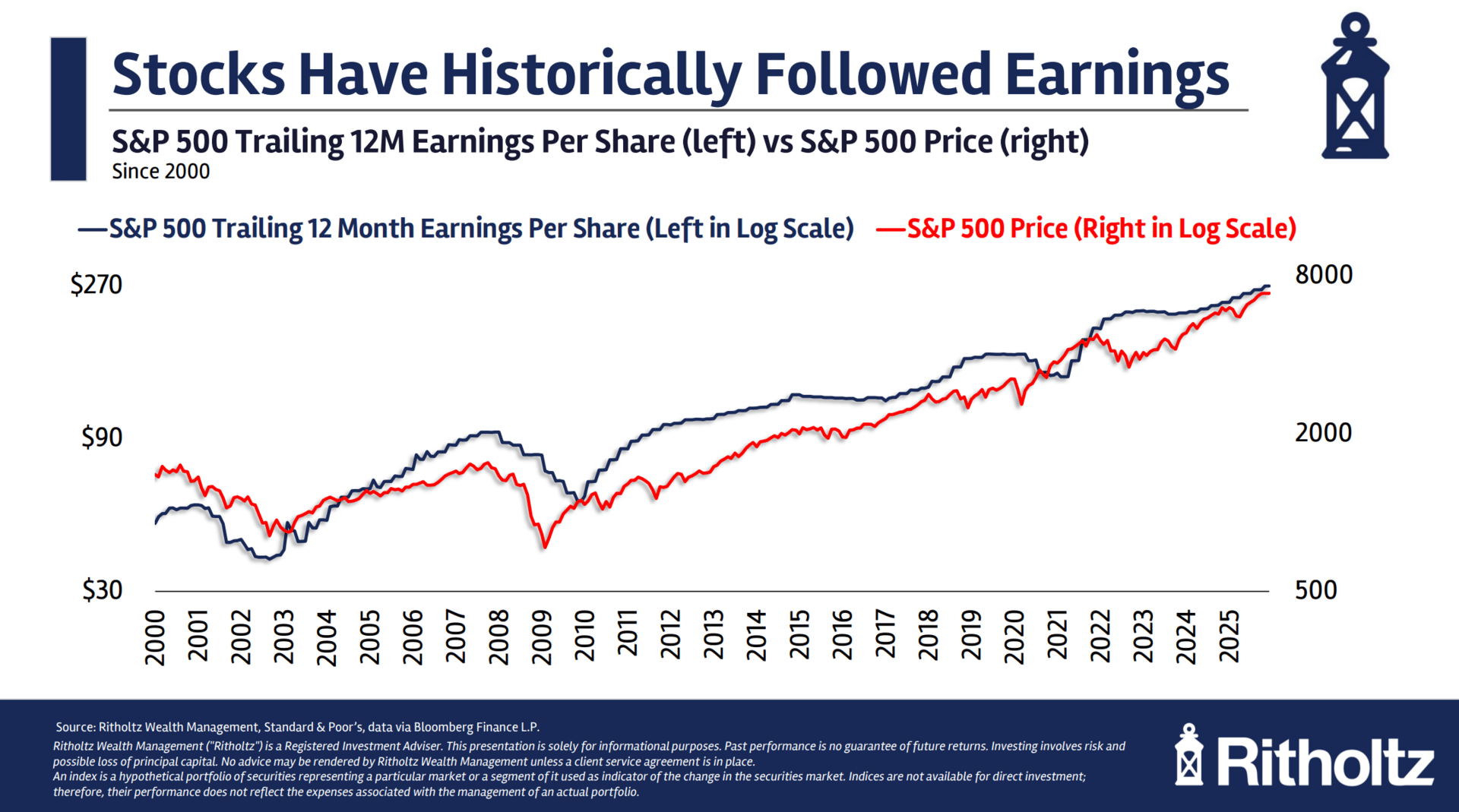
We’ve all seen the chart of the S&P 500 Price vs its Earnings Per Share over time.
It’s one of the best charts out there because it reveals a basic truth about the stock market:
Stock prices are driven by earnings.
Barry had me illustrate this concept in his quarterly call with clients of Ritholtz Wealth Management.

The chart is since 2000, but if I took the data back another 50 years the picture would look the same, trust me.
Actually, you don’t have to take my word for it. Sam Ro has done great work on the subject. He’ll explain it better than I can.
Anyways.
Let me visualize this idea in a different way for you.
Below I’m showing you the net income share vs the market cap share of each sector within the S&P 500 since 2005.

Each color represents a sector. Net income share is on the left and market cap share is on the right.
Let’s start on the left.
See how the Technology Sector’s net income share has grown over time? It’s the light blue shade at the bottom of the chart.
Now look at the chart on the right.
That same light blue shade rising over time is the market cap share of Tech growing concurrently with the net income share.
Energy, the orange shade, used to command a larger share of the S&P 500’s overall net income, but it has shrunk over time.
Its market cap share has done the same.
Pause on the chart for a sec and try to follow the story over time for each sector.
It’s both a fun exercise and also a reminder that a sector’s market cap share is directly linked to its share of profits generated.
Sometimes the stock market actually does make sense.
That’s all for today. Thank you, as always, for reading!

